MAYO CLINIC • CAPSTONE PROJECT
ROLE
Lead Product Designer
TIMELINE
Aug–Dec 2025
TEAM
3 Physicians
1 Advisor
3 Designers
SKILLS
Product Design
User Research
Stakeholder interviews
TL;DR
Cancer patients often face lengthy symptom questionnaires during treatment, adding to an already exhausting experience. I led the design of Luma, a patient-centered symptom-tracking experience developed with Mayo Clinic physician advisors. Using 11 symptom categories, progressive disclosure, and flexible reporting options, I redesigned the check-in to focus on relevant symptoms while reducing unnecessary effort. Usability testing with five participants informed design estimates of a ~5-minute check-in, ~78% less time than the ~23-minute full-form baseline, and ~65% fewer questions shown. All five participants completed the check-in during testing.
Context
Luma is an academic design concept developed in collaboration with physicians at Mayo Clinic. The project focused only on the patient experience; we did not design the physician-facing experience. In a real implementation, Luma's data could be connected to an EHR for care teams to access.
Overview
Cancer treatment can affect patients physically and mentally. At the same time, patients may need to regularly report the side effects they experience.
We explored how a structured clinical reporting process could become a more approachable digital experience for patients.
Instead of treating symptom reporting as a form that patients simply need to complete, Luma became a guided experience for reporting symptoms, capturing context, understanding changes over time, and finding a path to care.
The project centered around one question:
Problem
We were given the challenge of making cancer symptom reporting easier for patients while preserving the information clinicians need.
The PRO-CTCAE provides a structured way to capture patient-reported symptoms. The current adult library contains 124 items representing 78 symptomatic toxicities, with different items measuring things such as frequency, severity, interference, amount, or presence and absence of a symptom.
The challenge wasn't simply to redesign a long questionnaire. It was to understand how we could make this important clinical task easier for patients who may already be tired, uncomfortable, or overwhelmed.
Research
Before designing, we needed to understand where the burden actually came from.
We started with secondary research, literature review and then spoke with three Mayo Clinic physicians who advised us throughout the project.
The PRO-CTCAE is a flexible item library rather than one fixed questionnaire. NCI research found that a 20-item web-based PRO-CTCAE survey takes an average of 3.7 minutes to complete.
If that average were applied to all 124 items, completing the full library would take roughly 23 minutes.
Too much to process
A large number of questions can feel overwhelming when patients are already tired.
Irrelevant questions add effort
Patients may have to work through questions that don't apply to them.
Symptoms don't follow a schedule
A weekly check-in may not capture a symptom when it actually happens.
Symptoms can be missed
Simplifying the flow too aggressively can make relevant symptoms harder to discover.
Clinical structure still matters
Making the experience easier couldn't mean removing information clinicians depend on.
The experience is gold
Mood and personal reflections can provide additional context.
These findings gave us a clear direction:
Reduce unnecessary effort without hiding clinically important information.
Design
Based on our research, I explored an 11-category structure to organize the symptoms.
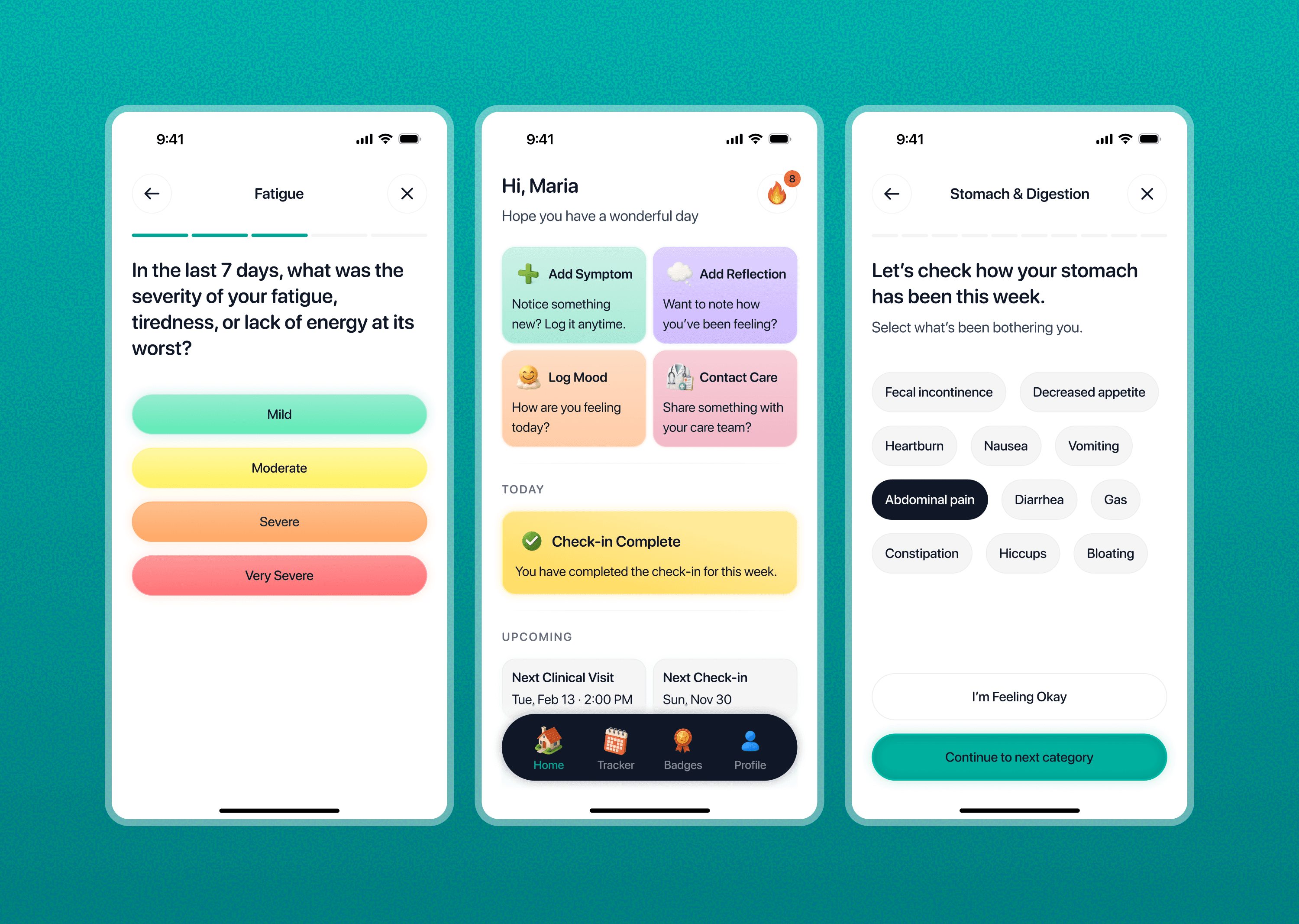
Instead of showing patients a long list, the check-in first showed categories. A patient could select an area, such as Gastrointestinal, and then see the symptoms within that category.
This reduced the amount of information visible at once and made the experience feel more manageable.
But this approach introduced a new problem.
When we reviewed the flow with our physician advisors, they pointed out a potential false-negative risk.
If a patient didn't select a category, they would never see the symptoms inside it. A patient could also experience a symptom without knowing which category it belonged to.
That meant reducing what patients saw could accidentally reduce what they reported.
So we redesigned the core interaction.
Instead of asking patients to choose which categories to explore, Luma guides them through all 11 categories sequentially.
Symptoms are visible within each category, but patients don't have to report every one.
“No symptoms in this area” lets them skip a category immediately.
This kept symptoms discoverable while reducing unnecessary effort.

ADD SYMPTOMS
Add Symptom lets patients report something whenever they notice it, instead of waiting for the next check-in.

ADD SYMPTOMS
Voice input and free-form reflections give patients lower-effort ways to describe what they are experiencing in their own words.

ADD REFLECTION
Mood tracking adds lightweight context without creating another long questionnaire.

LOG MOOD
The Tracker brings symptoms, moods, and reflections together over time so patients can look back and discuss their experience with their care team.

SYMPTOM TRACKER
Contact Care gives patients a way to reach their care team when additional support is needed.

CONTACT CARE
Design Principle
Design for the day when the patient has the least energy.
I kept coming back to one question:
Can someone complete this when they're tired, uncomfortable, distracted, or overwhelmed?
This influenced decisions around simple language, visible information, flexible symptom entry, and voice input.
The goal wasn't to remove clinical complexity. It was to reduce the effort required to move through it.
Validation
Five participants helped us identify where the experience could reduce effort.
We conducted usability testing with 5 participants, asking them to complete a Luma check-in and comparing the experience with the physical PRO-CTCAE flow.
The testing informed our estimates for the redesigned interaction.
Learnings
Hiding complexity isn't always reducing complexity.
My first instinct was to reduce what patients saw. Physician feedback showed that hiding information can create its own usability and safety problems.
I learned that healthcare UX often means finding the balance between clinical completeness and human effort.